
Acknowledgements1
I would like to thank Echo Australia and Macquarie University for inviting me to speak today.
I would also like to acknowledge the Traditional Custodians of the land on which we meet, the Wallumattagal clan of the Dharug Nation.2
I pay my respects to Elders past and present, and extend that respect to any First Nations people joining us today.
Federation
Australia is home to the world’s oldest continuing culture.
Aboriginal and Torres Strait Islander peoples have lived on this land for at least 65,000 years.3
We are also one of the oldest federations in the world, and this year we celebrate 125 years of the Commonwealth.
I’m reliably informed this is called a quasquicentenary — though apparently that word was only created in 1961.4
In 1901, supporters of Federation argued bringing the colonies or states as they are now known under one national government would …
- increase trade and strengthen each colony’s economy by removing internal tariffs and borders;
- create a national defence force to protect the continent in the event of invasion; and
- create a more democratic system of government, including extending voting rights to women.5
The founders of our Federation drew on the design of the US federation – one of only a handful of federations in existence at the time.6
We also adopted features of the British Westminster model of government.
And over the past century and a quarter, this ‘Washminster’ model has proven to be one of the world’s most successful federations.
Although not on the football field – we’ve never beaten another federation in the Men’s World Cup.7
A key feature of our federation has been our democratic principles underpinned by capitalism or a market-based economy.
We often hear that free markets are guided by an “invisible hand”, but trust between people is, in fact, key.
As economist and Nobel Laureate Kenneth Arrow famously wrote:
“Virtually every commercial transaction has within itself an element of trust.” 8
Even countries that aren’t democratic capitalist systems benefit from the global economic order created by democratic capitalism.
China’s economic transformation could not have occurred without trade, investment and demand from democratic capitalist economies across the world. China's entry into the WTO in 2001 transformed it into the "factory of the world", driving an explosion in its global trade.
Democracies and markets do not function automatically or without structure.
Markets depend upon laws, trust and public institutions to function effectively.
Change is constant
We are living through a uniquely transformative time.
With the advent of AI and other powerful technologies, it would be easy to conclude there’s never been a time like it.
And yet, if I’d given this speech 125 years ago, or at nearly any point since, the same would’ve been true.
Our lives and broader society are continually buffeted by technological change.
And we shouldn’t dismiss the lessons of the past. To illustrate this, I’ll turn to 2 thought leaders …
Søren Kierkegaard said, “Life can only be understood backwards; but it must be lived forwards. ” 9
150 years later, Billie Eilish asked, “If I knew it all then, would I do it again?” 10
We rarely know enough in the present to judge it fully.
That’s why economists take a long-term perspective, and avoid the mistake of thinking everything now is everything we know.
Today, I’ll explore our Federation’s history through 5 charts and how they can help us understand today’s policy debates.
And, appropriately for the age we live in, I can tell you these charts were generated with some help from AI.11
I’ll start with one of the most important …
The unemployment rate over the past 125 years.
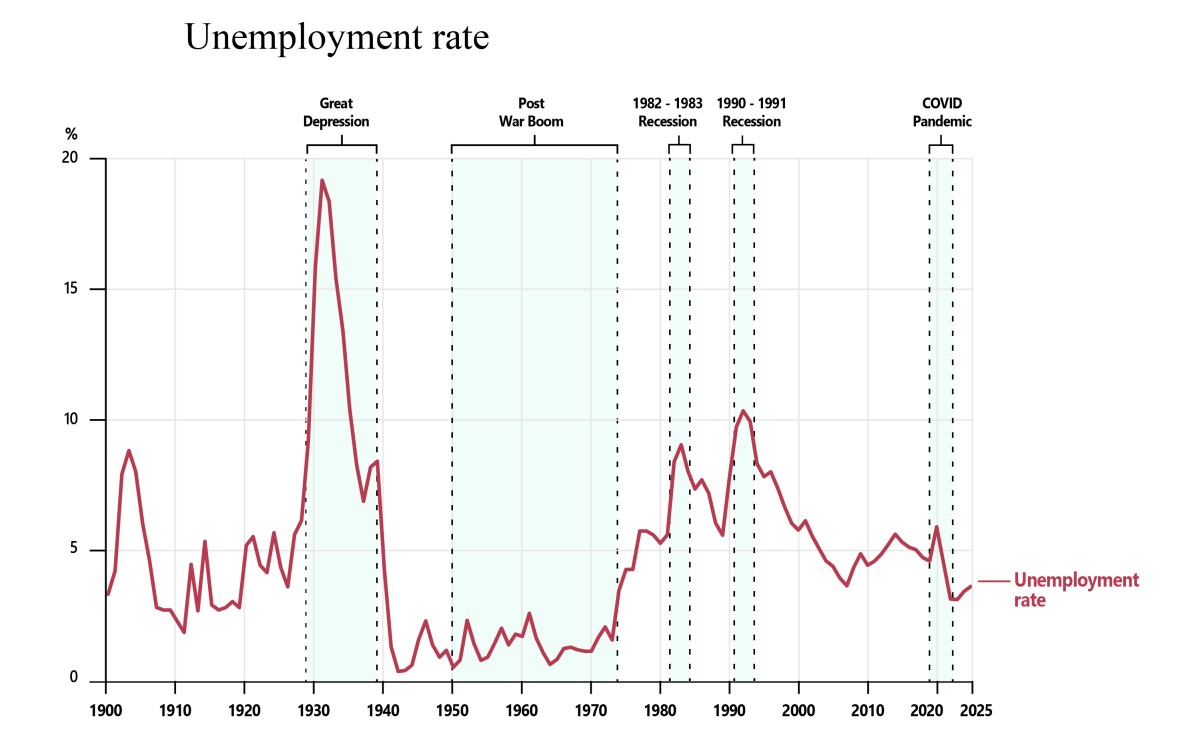
The unemployment rate varies significantly over time.
It rises sharply during major economic downturns such as the Great Depression and recessions.
And falls during periods of strong economic growth.
While unemployment today is not as low as the post-war boom of the 1950s and 1960s, it remains relatively low compared with most of Australia’s history.
Why is this one of the most important charts?
Economists track hundreds of indicators, including inflation, GDP, productivity, wages and interest rates.
They are all important. However, the unemployment rate provides a unique insight into whether an economy is working for all people, especially the disadvantaged.
Employment matters profoundly for individuals, families and communities—especially for those of you preparing to enter the workforce.
Every percentage point in this chart represents real people.
It represents people who want to work but can’t find a job.
And when unemployment rises, the consequences are felt in confidence, mental health, family wellbeing and social cohesion.
Recessions leave lasting scars.
A person who spends an extended period unemployed can lose skills, confidence and valuable work experience.
By comparison, a strong labour market also helps people find suitable jobs faster, earn higher starting salaries, and build skills.
The chart also shows that economic shocks have not always produced the same outcomes.
During the 1970s, 1980s and 1990s recessions, unemployment rose sharply and took many years to fall back to previous levels.
But then during the Asian financial crisis of the late 1990s, the GFC of the 2000s, and the COVID-19 pandemic, the rise in unemployment was much smaller.
Why was there this difference? A big part of the story is that Australian policy makers learned from the earlier episodes and created new policy approaches – built around a flexible exchange rate system, decentralised wage-setting, and judicious use of monetary and fiscal policy – that allowed Australia to better handle the later shocks.
What this tells us is that the institutions we build, the policies we adopt and government decisions can influence how well economies withstand shocks.
And how quickly they recover from them.
Over the past 125 years, governments of different political persuasions have often disagreed on the best policies to support employment opportunities.
But there has been a longstanding commitment to creating the conditions for Australians to find employment.
My second chart is inflation over the past 125 years.
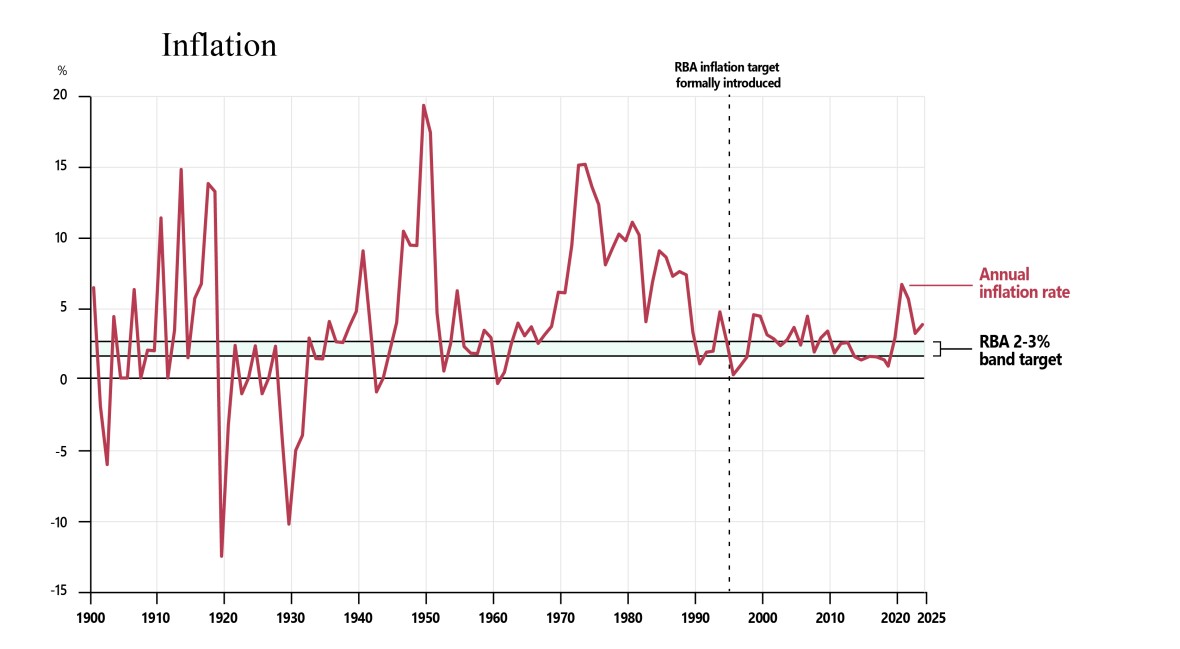
Although inflation increased substantially following the COVID recovery and war in Ukraine, it remained below the levels experienced during Australia’s major inflation episodes of the 1970s and early 1980s.
One of the big economic achievements of the past 30 years is keeping inflation relatively low and stable compared with earlier decades.
This highlights the important role operationally independent institutions such as the Reserve Bank of Australia play.
Maintaining price stability while also supporting strong and stable employment and rising living standards is important.
But there can be trade-offs in achieving these objectives.
This tension sits at the heart of an important idea in economics: the Phillips curve.
More than half a century ago the New Zealand economist Bill Phillips established that data showed an inverse relationship between inflation and unemployment.
The Phillips curve has been a valuable guide for policy makers in the last 60 years. But we should be careful not to think of this relationship as fixed.
The relationship also varies over time. Policy can influence inflation and unemployment. Expectations, institutions and policy frameworks have changed, and so too has the relationship between inflation and unemployment.
The decade before the pandemic provides a useful example.
Inflation was often below the RBA’s target range, while wages growth was unusually weak.
This led to debate about whether unemployment could fall further without raising inflation.
If inflation remains persistently below target, it may be a sign that the economy could support more jobs and stronger growth than it currently has, and that people who want a job are missing out on opportunities.
The experience of the past few years posed the opposite question.
As inflation surged following the pandemic, many economists expected that bringing it back under control would require higher interest rates, weaker economic growth, and a significant increase in unemployment.
Instead, inflation fell while the labour market remained relatively strong even though the economy did weaken.
What does this tell us? Economic relationships evolve over time, and policy makers must always remain open to new evidence.
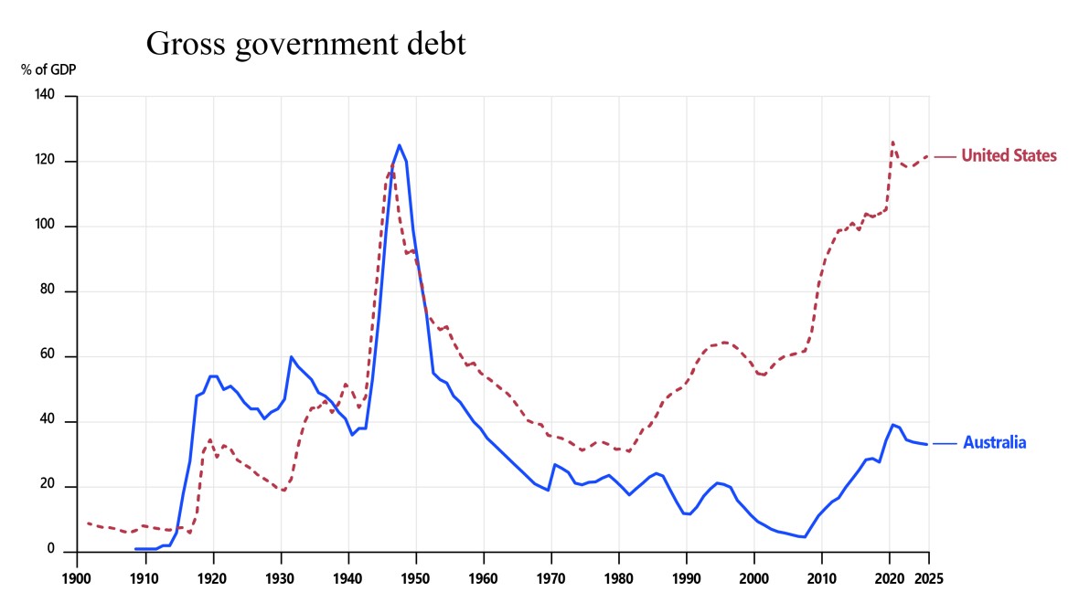
The third chart on my list is government debt as a share of GDP.
Most years, on the second Tuesday of May, the government brings down the Budget. One of the key questions economists ask is whether government finances are sustainable over time.
The chart shows government debt tends to rise during major crises.
Debt increased sharply during the first and second world wars, and again during periods following major economic disruptions.
The historical record reminds us that governments need to respond to extraordinary events and that places significant pressure on public finances.
During wars, recessions and other national emergencies, governments often borrow to support the economy and provide essential services.
In these circumstances, debt can act as a buffer, helping spread the cost of major shocks across generations.
Australia’s debt has increased in recent decades, prompting debate among economists about the size and sustainability of public finances.
While the pandemic contributed to higher debt, much of the increase had already occurred, reflecting pressures that had built over time. Particularly through accumulated interest repayments, and fast-growing expenses in areas such as aged care and health.
And it’s important to keep Australia’s situation in perspective; I have added the United States government debt to the chart.
The difference is striking.
Australia’s debt remains low by both historical and international standards.
But history also reminds us that major shocks can emerge unexpectedly and place significant pressure on public finances. In ‘good times’ we need to have policy settings that restore debt to levels such that it will be possible to respond in a relatively unrestricted way when major negative shocks hit.
Looking across 125 years of history, the lesson is that governments should always expect the unexpected.
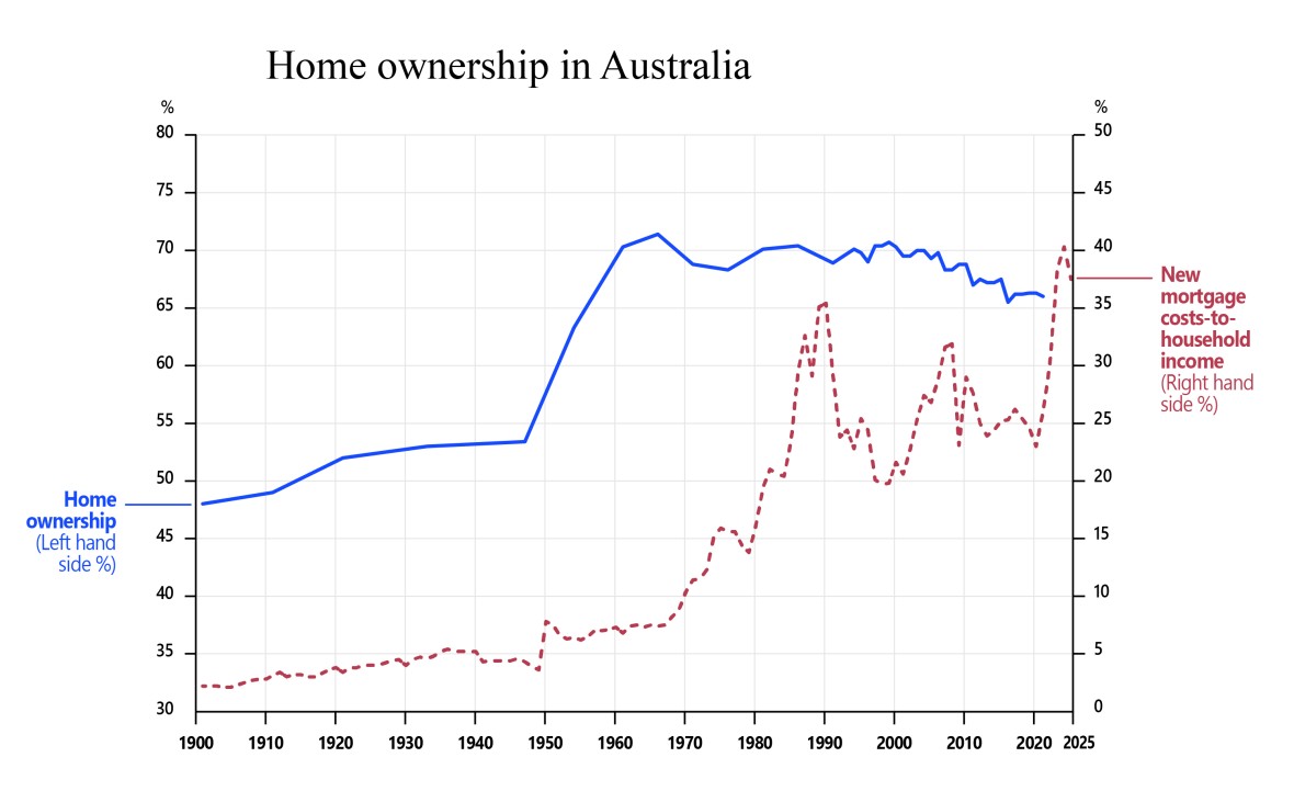
Notes: Mortgage costs (annual P&I repayments) for a new 30-year loan at 80% LVR for the national average house price, at the prevailing standard or discounted variable rate, as a share of average gross annual disposable household income. Pre-1980 house prices and pre-1960 incomes rely on spliced secondary sources and interpolation. Levels in the early part of the series should be read as indicative of the broad trend rather than precise annual figures.
At the most recent Budget the government announced some changes to tax.
Part of the motivation for these changes was to improve housing outcomes, especially for home ownership.
Home ownership offers security, financial stability and long-term wealth accumulation for households.
Governments actively promoted it through cheap finance, land release and housing bonds.
Ownership rose from around 50% of households in 1911 to a peak of around 70% in the post-war period.
By the early 1970s, Australia had the second highest rate of home ownership in the developed world.12 Since then, the trend has reversed.
The next chart helps explain why.
Let’s overlay home ownership with the proportion of income people spend servicing new mortgages.
These 125-year trends point to a growing disconnect between housing costs and household income.
Australian house prices have risen strongly since the 1970s, often faster than household income.
The proportion of household income required to meet servicing costs on a new mortgage has risen to historically high levels.
And this occurred despite a long period of low interest rates. Lower borrowing costs enabled households to take on larger loans, leading to higher overall debt levels and mortgage repayments taking up a bigger chunk of household income.
The result is households under strain and also home ownership becoming harder to achieve, particularly for younger Australians.
We are already seeing how households are adjusting.
Younger Australians are staying at home for longer.
More people are sharing housing to manage costs.13
When I was around your age, just over half of young people in their early twenties had moved out of home.14 Today, that’s shifted — in 2021, around one in three people aged 15 to 24 had moved out of home.15
Responding to challenges like home ownership and housing affordability are rarely simple.
They involve trade-offs, competing objectives and difficult choices.
But we know that additional housing supply is needed, and that tax arrangements can also support home ownership.
In selecting 5 charts to illustrate features of the economy I’d always include productivity.
Productivity is what delivers higher levels of prosperity and is crucial to maintaining social harmony.
But today you are going to hear from the Chair of the Productivity Commission, Danielle Wood, so I know you will be given excellent insights into dimensions of productivity.
So I’m going to step back and ask a broader question:
What do these trends mean for the lives of Australians?
That brings me to the final chart.
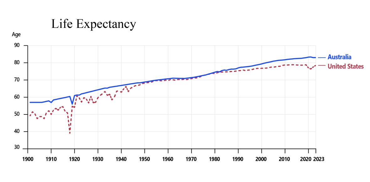
Notes: Pre-1949 life expectancy in Australia relies on linear interpolation between documented anchor years where data was not available. Levels in the early part of the series should be read as indicative of the broad trend rather than precise annual figures.
Over the past 125 years, Australians’ life expectancy has improved dramatically.
A child born today can expect to live decades longer than someone born at the time of Federation.
Someone who is 18 today can expect to live well into their 90s, and some may celebrate their 100th birthday.
To provide some international perspective, I have again included the United States in this chart.
While both countries have experienced substantial gains in life expectancy over time, Australians’ life expectancy is now among the highest in the world. (10th highest in the world).16
What makes this comparison particularly interesting is that the United States has higher income per person than Australia. (US$90,000 for the United States versus US$77,000 for Australia in 2025).17
Yet Australians on average live longer (83 years compared to 78 years for the United States). While difficult to attribute precisely, part of this gap likely reflects disparities in access to healthcare – with Australia’s Medicare system providing more universal coverage, particularly when it comes to low-income households.
It is a reminder that while economic prosperity matters, outcomes also depend on the institutions, policies and choices that shape how societies translate wealth into wellbeing.
Conclusion
Because increased life expectancy means more time.
And time is the most valuable currency we have.
It is finite. It cannot be reproduced.
And you have more of it than I do, or than any of today’s speakers.
I’d urge you to treat your time like an economist:
Use it wisely and learn from the patterns of the past.
The challenges facing your generation will differ from those of previous generations.
They will include artificial intelligence, climate change, population ageing, geopolitical uncertainty, and issues we cannot yet foresee.
And we know Australia’s success rests on institutions that balance competing forces and adapt over time.
Understanding this history will help you navigate change and respond to challenges.
You’ve seen today the impact of the choices made by governments and individuals over time.
And those choices will be yours and they will matter for you and future generations.
Thank you.
References
- Thank you to everyone who contributed to the preparation of this speech. Particular thanks to Professor Jeff Borland, Jenny Wilkinson PSM, Adam Cagliarini, Danielle Wood, Meghan Quinn PSM, Simon Duggan, Hamish McDonald, Jeremy Lawson and Jason McDonald who generously shared their time and expertise to comment on drafts. I would also like to thank Karla Rayner, Maddie Sharp, Louise Rawlings, John Ratchford, Tori Aston, Grace Patricia, Susan Belardi, Johan Hamsa, Catherine Collard and Michelle Janota-Sullivan for their assistance in preparing the speech. Return to footnote 1 ↩
- Our commitment to Indigenous Australians | Macquarie University Return to footnote 2 ↩
- Historical Context - Ancient History | Bringing Them Home Return to footnote 3 ↩
- SMITH HISTORY BLOG: Quasquicentennial – Smith Center for the Arts Return to footnote 4 ↩
- Parliament Explained Federation – Parliament of Australia Return to footnote 5 ↩
- Possibly 8 depending on how federalism is defined - Argentina – 1816, Canada – 1867, Brazil – 1891, Germany – 1871, Mexico – 1857, United States – 1776, Venezuela – 1864, Switzerland - 1848. Return to footnote 6 ↩
- West Germany, 1974 (lost 0-3), Brazil, 2006, (lost 0-2), Germany, 2010 (lost 0-4), Argentina, 2022 {lost 2-1). Return to footnote 7 ↩
- The effect of trust on economic performance and financial access - ScienceDirect Return to footnote 8 ↩
- Source of Søren Kierkegaard quote Return to footnote 9 ↩
- Billie Eilish – everything I wanted Lyrics | Genius Lyrics Return to footnote 10 ↩
- Generative AI tools were used to assist in sourcing publicly available datasets or supporting information to construct consistent long-run series for the charts in this presentation. AI was used in accordance with Australia’s AI Ethics Principles, the Digital Transformation Agency’s Policy for the responsible use of AI in government (PDF) and APS Values, Code of Conduct and Employment Principles. AI generated content was subject to human oversight, review and further analysis by PM&C. No classified, ministerial or other sensitive information was entered into AI tools. Return to footnote 11 ↩
- Housing Australia: A Statistical Overview, 1992 Return to footnote 12 ↩
- State of the Housing System 2026 Return to footnote 13 ↩
- ABS, Australian Social Trends 1997 (cat. 4102.0) Return to footnote 14 ↩
- Australian Housing and Urban Research Institute (AHURI), analysis of the 2021 ABS Census, ‘What are the real costs of the housing crisis for Australia’s young people?’ Return to footnote 15 ↩
- Life expectancy, 2022 - 2024 | Australian Bureau of Statistics Return to footnote 16 ↩
- OECD Data Explorer, Annual GDP and consumption per capita, US $, current prices, current PPPs Return to footnote 17 ↩